Follow dranorter
dranorter
dranorter
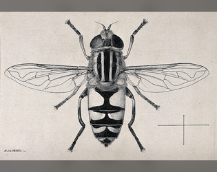
Hoverfly
Lighthearted Stack game about defending territory, for Megamitt's game jam
dranorter
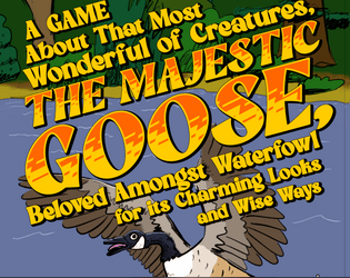
Majestic Goose
$1.50
A solo journaling game about a goose getting in ever greater trouble.
dranorter